
Making “Exploring Friending Bias in U.S. Public Schools” in d3.js
12/19/2022
Check out the project here.
For my final project in d3 for VisTech I, completed at Northeastern University for my M.S. in Information Design & Data Visualization, I decided to use data from research I’ve been working on as a research assistant with the Plural Connections lab, which looks at factors affecting economic mobility and social capital in U.S. public schools. On the one hand, I already had the data downloaded and was familiar with the variables. On the other, I was excited to see how I could put this data that I was already familiar with in a statistical setting to use in a dynamic visualization setting. Since the research I’ve been helping out with is still ongoing, I did not want to create a tool that pointed to any definitive conclusion, but rather an exploratory tool that allows audiences to take a look at how different factors affect friending bias.
Since the dataset is relatively large (~1800 schools), I initially planned on making a 2-d density plot between friending bias and the percent population of different demographic groups. However, my first attempt to use code from d3 graph gallery was not successful…
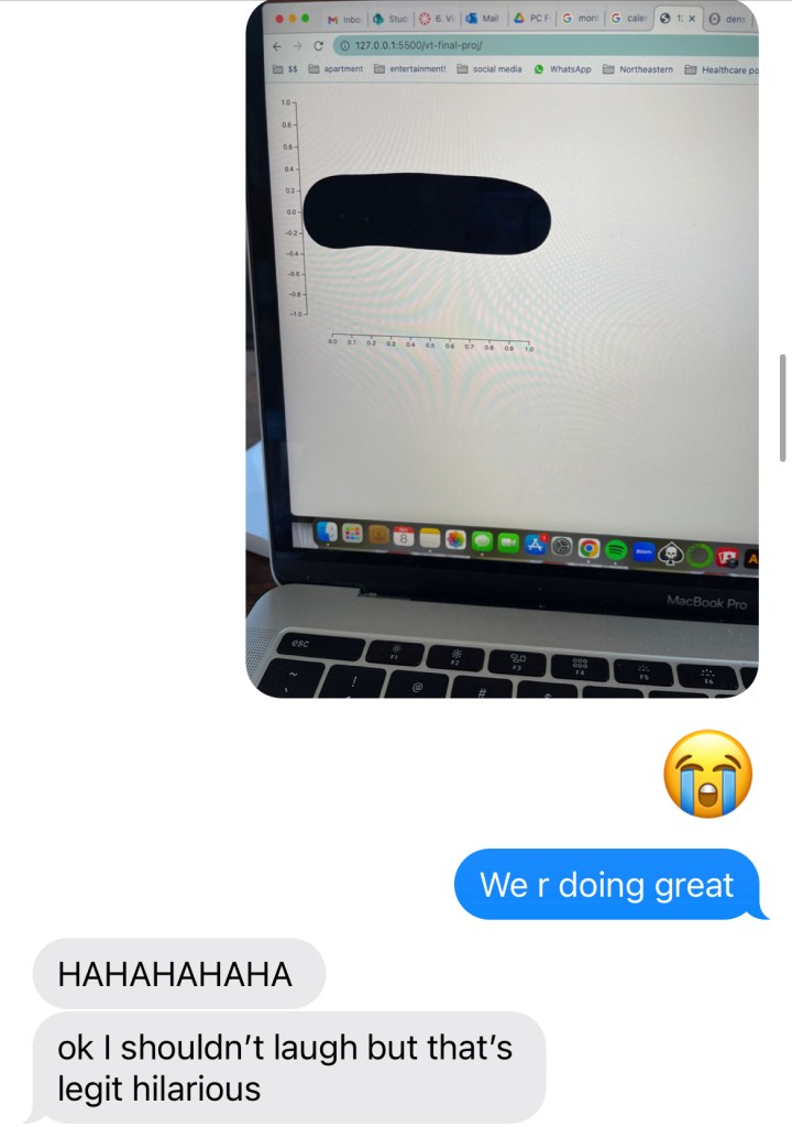
6 hours later…

A real conversation I had with my friend.
I also realized that implementing a hover function would be pretty difficult and not user-intuitive on a density plot, and given the parameters of the assignment and my lack of success initially, I ended up pivoting to a scatterplot.
The dataset I used is luckily quite clean and easily comprehensible, not to mention I’ve been working with it throughout the semester, so I understand it pretty well. The only data manipulations I had to do were to convert the measures columns to numeric in js and multiply the columns representing percents by 100 (as they were initially in decimal form).
A scatterplot proved much more successful, as I was able to make something that did not look “like a worm” pretty quickly. I was able to make it such that a user hovering their cursor on a point would be able to see some copy about that particular school’s friending bias. Ideally, I would have been able to include the school name, but unfortunately did not have that column in the dataset. Upon some reading and reflection, I realized that I needed to implement some kind of zoom functionality into my visualization, since I had many overlapping datapoints, and if I expected users to hover, I needed to give them the option to filter out some of the data on their end. I decided on an x-axis zoom, where users can input the limit of the x-axis they want to see, since brushing would also interfere with the hovering.
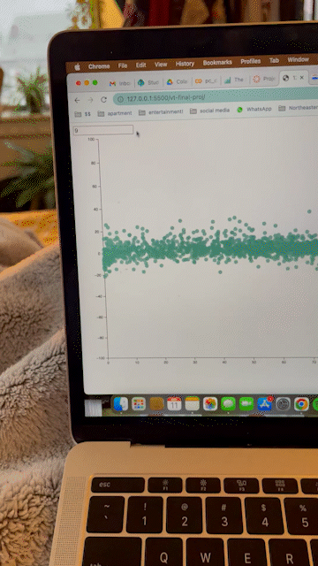
First big breakthrough: X-axis limit zooming and point hovering!
The dataset had columns for the percent that multiple demographic groups make up in schools: percent White, percent Black, percent Hispanic, percent Asian, percent Native American/Pacific Islander, etc. For my “click” functionality, I knew that I wanted to make it such that users could compare friending bias against these demographic measures. Since there are so many, I figured the best solution would be to make buttons for each group and update the X-axis accordingly so the user can pick and know which group they’re looking at at all times. One weird error I kept getting was that the X-axis labels would overlay each other as I kept clicking the update button, so I “hacked” it by laying a white rectangle underneath the new text each time – it worked!
I also initially wanted the color of the dots to change every time that the user clicked on a different demographic group, but was having difficulty implementing that. I then decided to make the color a sequential gradient of a different variable: exposure. This fixed the color-changing issue, and also adds a new dimensionality to the visualization: users can see that, for example, schools with higher percentages of Asian students seem to also have higher exposure levels.
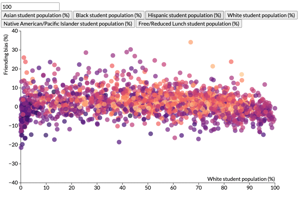
Finished! Woohoo!
Final Thoughts
I had a lot of fun completing this project and am proud of how it all turned out. I was intimidated by d3.js at the start, and while I still am certainly wrapping my head around how it all works on a technical level, completing this project demystified some of that fear and anxiety and showed me that the customizability of d3 – while scary – is what makes it so rewarding and cool!
